UX & Product
Energy App Redesign
2.1 → 4.5
Google Play rating
< 60% → 95%
First-time login success
IDI Award
Accessibility recognition
A 2.1-star rating that wasn't measuring the app. It was measuring how customers felt about their energy bills.
, National Energy Provider, Google Play Store
Client
National Energy Provider
Role
Senior Product Designer
Timeline
Nov 2022, Feb 2024
Tools
Figma, Maze, Optimal Workshop
A 2.1-star app. And a team determined to change that.
The National Energy Provider had no native mobile app for residential customers when the engagement started. By the time it launched, it had a 2.1-star rating, not because the app was poorly designed, but because customers were using it to vent about their energy bills. I was embedded across the engagement for almost two years, contributing to different workstreams as they needed design attention. Account cards, dashboard, navigation, the Net Zero Hub, and the design system through a full rebrand. The challenge was never just to design a good app. It was to design one that could earn its own reputation, separate from how customers felt about their energy provider. Getting from 2.1 to 4.5 stars required every decision to be right, not just most of them.
THE REAL CHALLENGE
"The app was absorbing blame it had nothing to do with. The design had to be good enough to change the conversation."
Modern product thinking. Constrained palette. Active rebrand.
National Energy Provider had no native mobile app for residential customers when we started. The brief called for something that felt modern and trustworthy, stakeholders pointed at N26 and Revolut as aspirational benchmarks. But we were working within a brand palette that offered almost nothing: one blue, four greys, one green, no accent colours. And partway through the engagement, National Energy Provider began a full rebrand, meaning some of the brand foundations we'd been designing within were actively changing. WCAG AA compliance was non-negotiable as a regulatory requirement, which shaped every colour, layout, and interaction decision throughout and frequently ruled out directions stakeholders initially preferred.
01
Test before deciding
Every major navigation and layout decision was validated through usability testing before handoff. Stakeholder preference was a data point, not a decision.
02
Accessibility as design constraint
WCAG AA compliance shaped every colour, layout, and interaction decision across the engagement, from account card contrast to error states built from scratch.
03
Design system during a rebrand
Building a component library while the brand was actively evolving meant anchoring every decision to compliance rather than a moving aesthetic target.
Research-led decisions across a long engagement.
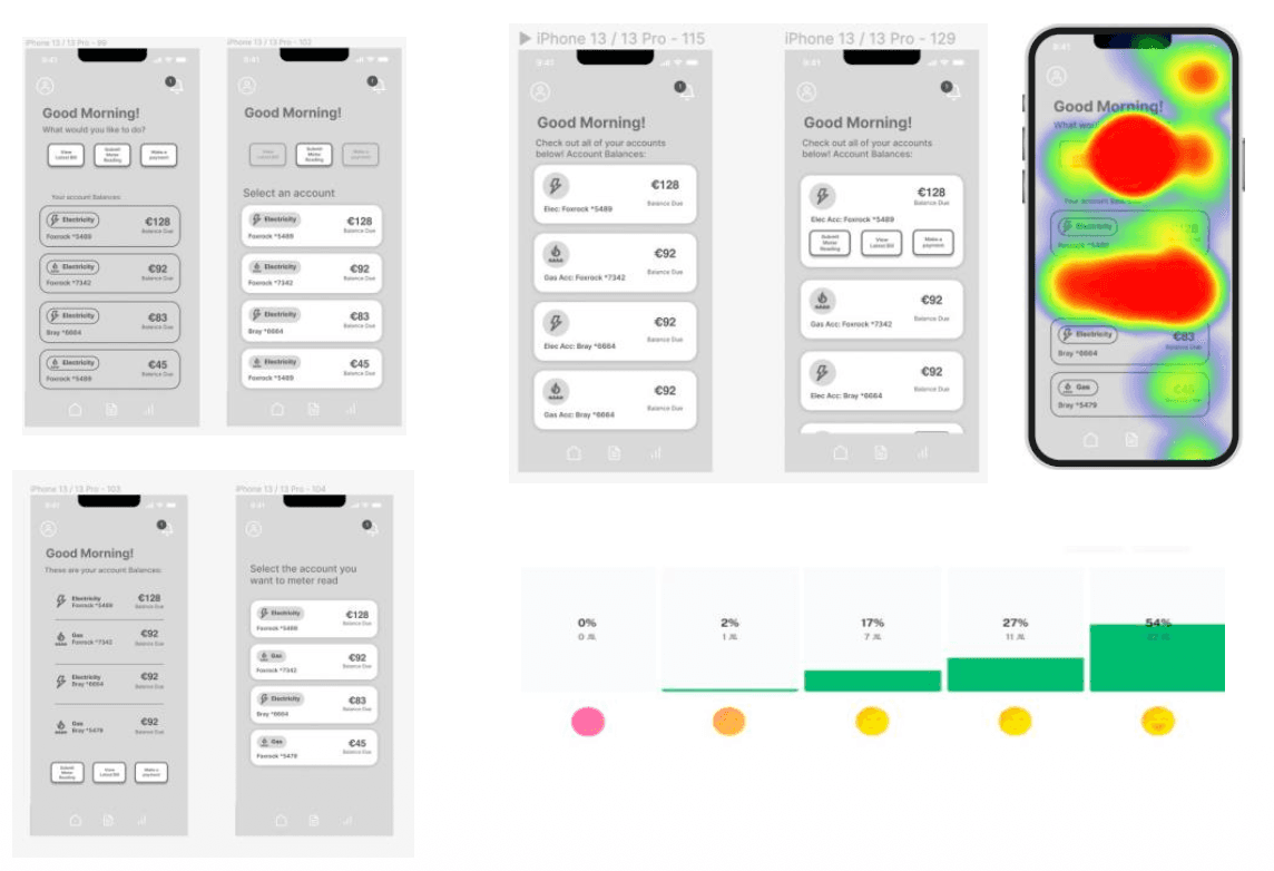
Three layouts tested with 41 participants, the hybrid model won on task success, mis-click rate, and perceived intuitiveness
The hybrid model won on every metric.
Three dashboard layouts tested with 41 participants. The hybrid model, account selection first then action selection, achieved 100% task success rate, the lowest mis-click rate, and the fastest completion time. The structural decision mattered more than the test result. The hybrid IA supported two distinct mental models simultaneously, task-oriented and account-oriented users, without forcing a compromise on either.
A usability preference that was also the right accessibility call.
Testing with 28 participants showed 50% preferred account cards collapsed by default. The more important finding was why it was right beyond preference. Collapsed cards reduced scrolling, minimised cognitive load, kept CTAs uncluttered, and improved screen reader experience by preventing unnecessary content from being announced until a user needed it. 92.9% task success rate. A preference data point that converged with the right accessibility call.
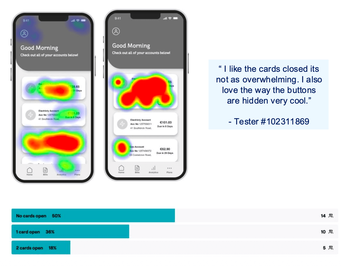
Collapsed by default, 50% user preference, 92.9% task success rate, and the right accessibility decision
The feature we wanted to push further.
What shipped was a well-designed but generic energy-saving page, the same tips for every customer regardless of their actual usage. What we pitched was a personalised hub: each customer's real consumption data surfaced as tailored recommendations. Showing someone who uses 40% more electricity than average between 6-9pm a specific insight, not a generic list. The client deprioritised it. The data infrastructure wasn't in scope. The generic version shipped. The personalised version is still the right call for a future iteration.
Net Zero Hub walkthrough, the personalised version that was pitched vs the generic version that shipped
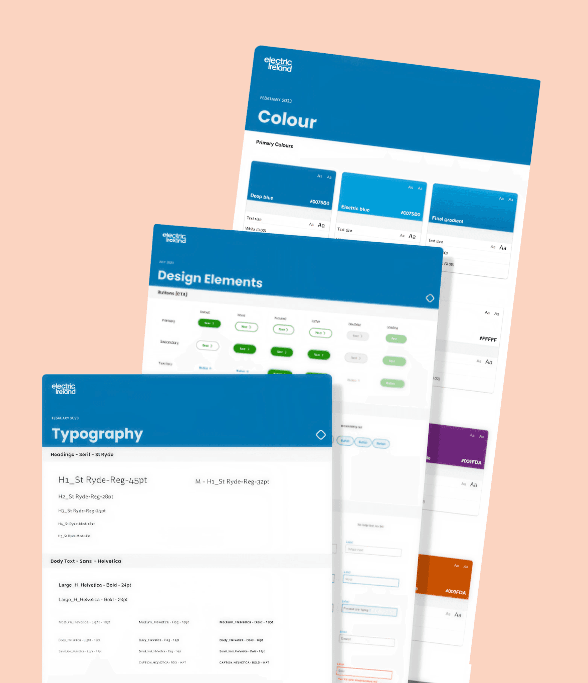
The component library built during an active rebrand, every decision anchored to accessibility compliance
Building a design system while the brand was changing underneath us.
National Energy Provider was rebranding mid-engagement, meaning we were designing within guidelines that were incomplete for digital and actively changing. We treated WCAG AA compliance as the fixed anchor. If a decision met compliance and stayed within existing web brand guidelines, it would survive whatever the rebrand delivered. The design system was built on Native Base patterns, chosen for customisation depth and strong accessibility documentation. Every component was production-ready at MVP handoff.
We'd done good work. The rating didn't show it. Until it did.
The most memorable moment wasn't a design decision. It was watching the Google Play rating move from 2.1 to 4.5 after nearly two years of work. For a long time the app was absorbing blame it didn't deserve: reviews about bills, customer service, and energy prices showing up as one-star ratings on a product that had nothing to do with those things. Designing the review prompt to trigger after a user had successfully completed an action, rather than at a random frustrated moment, was the intervention that made recovery possible. The IDI accessibility award felt earned. Not because we ticked a compliance box, but because we made accessibility a design constraint from the start.

Watching the rating go from 2.1 to 4.5.