UX & Product
Warehouse Operations Management Platform
80%
Reduction in UI bugs
3 of 7
Apps delivered
Mentorship
Requested by junior designers
The designers, developers, and client weren't working from the same reality.
, Food & Flavour Manufacturer, Month 3
Client
Food & Flavour Manufacturer
Role
Design Lead (Embedded Team)
Timeline
Feb 2025, May 2025
Tools
Figma, FigJam, Mendix
A project three months in. Already in trouble.
Food & Flavour Manufacturer was replacing SAP with a suite of seven custom apps for their warehouse operators. When I joined as design lead, the client had lost confidence. Designs were off-brand and disconnected from real warehouse logic. Developers were building against multiple React component libraries simultaneously. And the process had a structural flaw that nobody had named yet: design was being excluded from the decisions that shaped the work before design even began.
THE REAL PROBLEM
"Design was excluded from initial scoping, and was the last to find out what that cost."
Fix the process before fixing the screens.
The visible problem was design quality. The actual problem was that warehouse leads were seeing screens for the first time in PO review meetings, and their feedback was changing UX flows that had already been built. Every loop cost time nobody had. Fixing the screens without fixing the conditions that produced them would have changed nothing.
01
Get the right people in the room earlier
The functional team, warehouse leads, PO, BA, and design needed to align on prioritised features before any flows or screens were touched. That single change eliminated the source of most rework.
02
Design sits with the functional team
Instead of receiving technical flows as a brief, I sat with the functional team to understand them, surfacing UX constraints before screens began. Is the user moving from an RF scanning gun to a tablet? Do different warehouses need different views?
03
Warehouse leads sign off flows before screens
UX flows were confirmed with warehouse leads as a dedicated step, not as part of a full PO review. By the time screens were presented, there were no surprises. Feedback was refinement, not redirection.
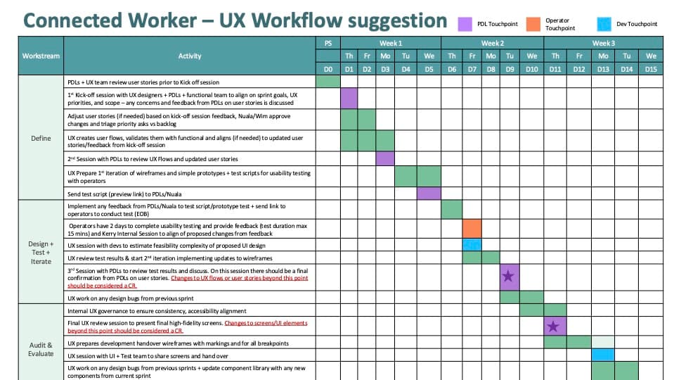
Before and after, the process that changed everything.
Where the loops came from, and how we stopped them.
In the old process, warehouse leads were seeing screens for the first time in PO review meetings. Their feedback, legitimate, informed, necessary, was arriving too late. Flows would change. Screens would go back. Time nobody had would disappear. The new process moved warehouse leads upstream: into feature prioritisation, into UX flow review, before a single screen was designed. By the time screens reached the weekly meeting, they already had operator buy-in. The PO was reviewing work that had already been stress-tested.
The resistance wasn't irrational.
Warehouse operators were being asked to abandon SAP for something that felt imposed on them. I set up dedicated sessions with operators, separate from PO and business stakeholder sessions, to surface everything that hadn't made it into the formal requirements. What did they actually need? What were they worried about? What would break their day if we got it wrong? That research fed directly into the UX flows and into the sprint framework, where operator testing became a non-negotiable touchpoint in every cycle.
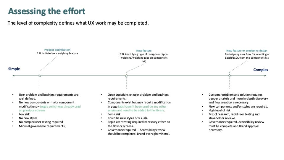
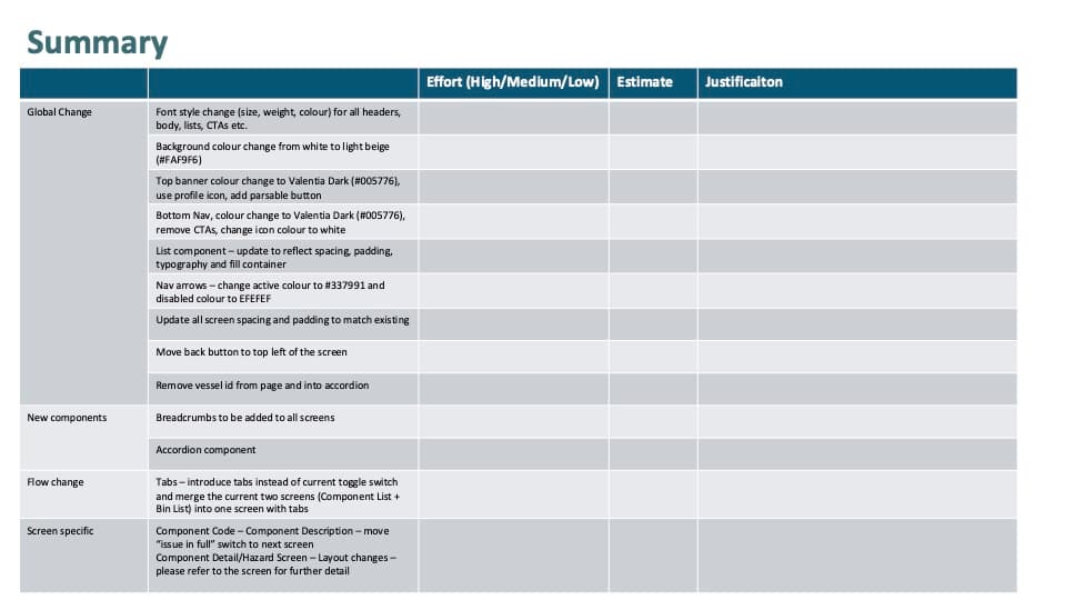
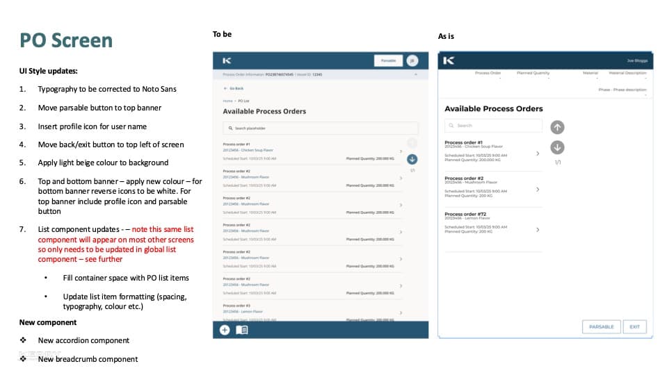
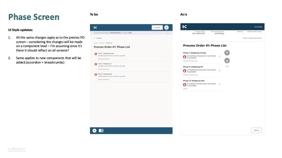
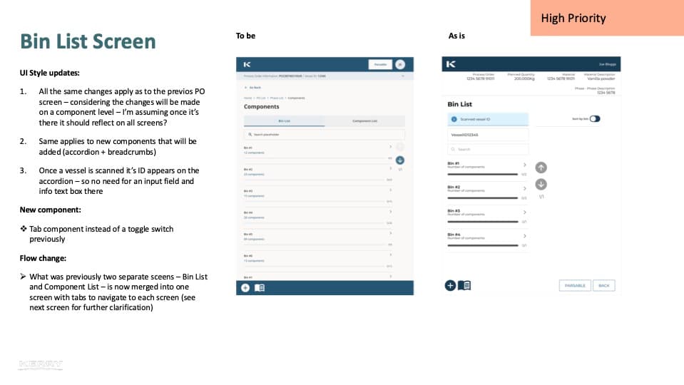
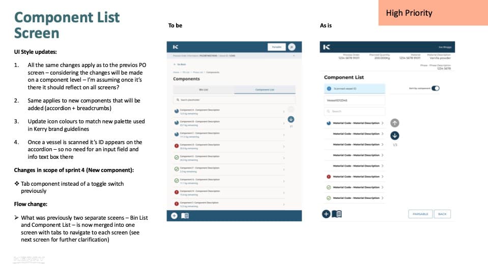
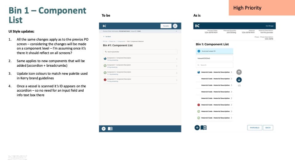
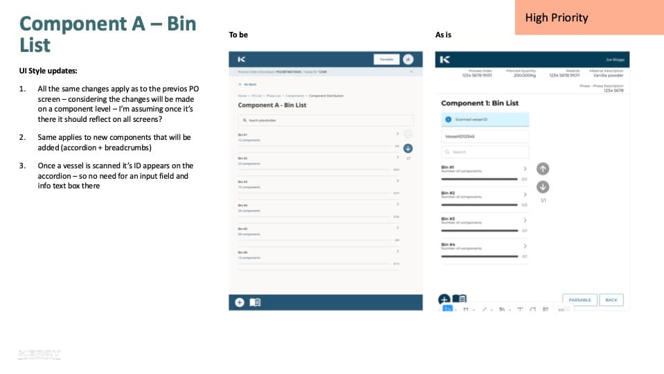
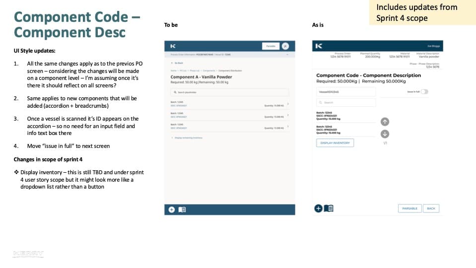
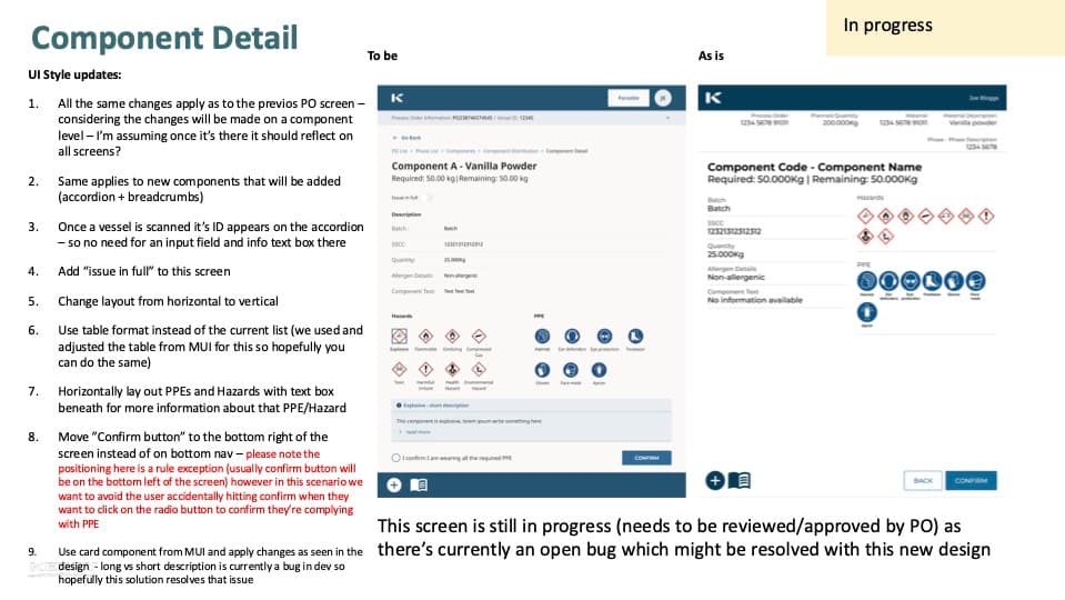
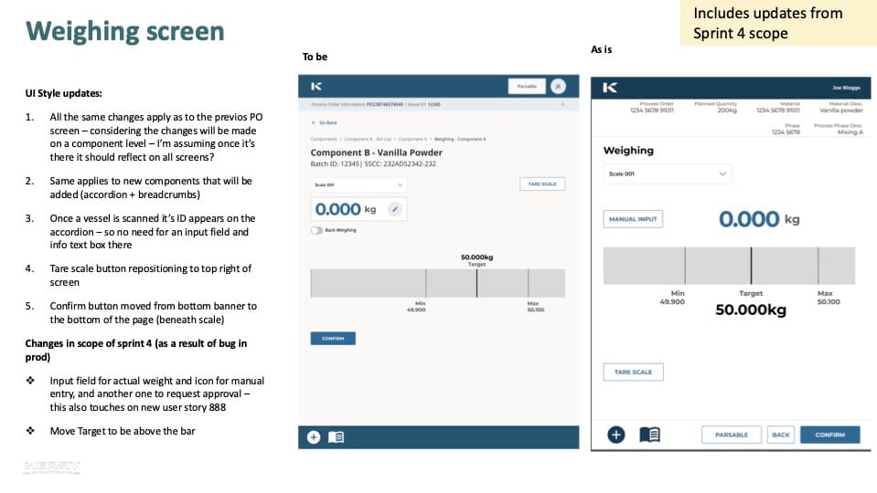
The full UI updates handover, 11 screens mapped as-is to to-be
One library. Both teams.
In parallel, I audited every previously designed screen against a new unified component system. The problem wasn't just process, developers were building against multiple component libraries simultaneously, making every handover a game of telephone that ended in bugs. We got design and development in the same room, agreed on a single source of truth, and mapped it to Food & Flavour Manufacturer's style guide. The UI updates document became the handover artefact: every screen shown as-is alongside to-be, with numbered annotations. 80% reduction in UI bugs followed.
Three apps. Designed from the warehouse floor up.
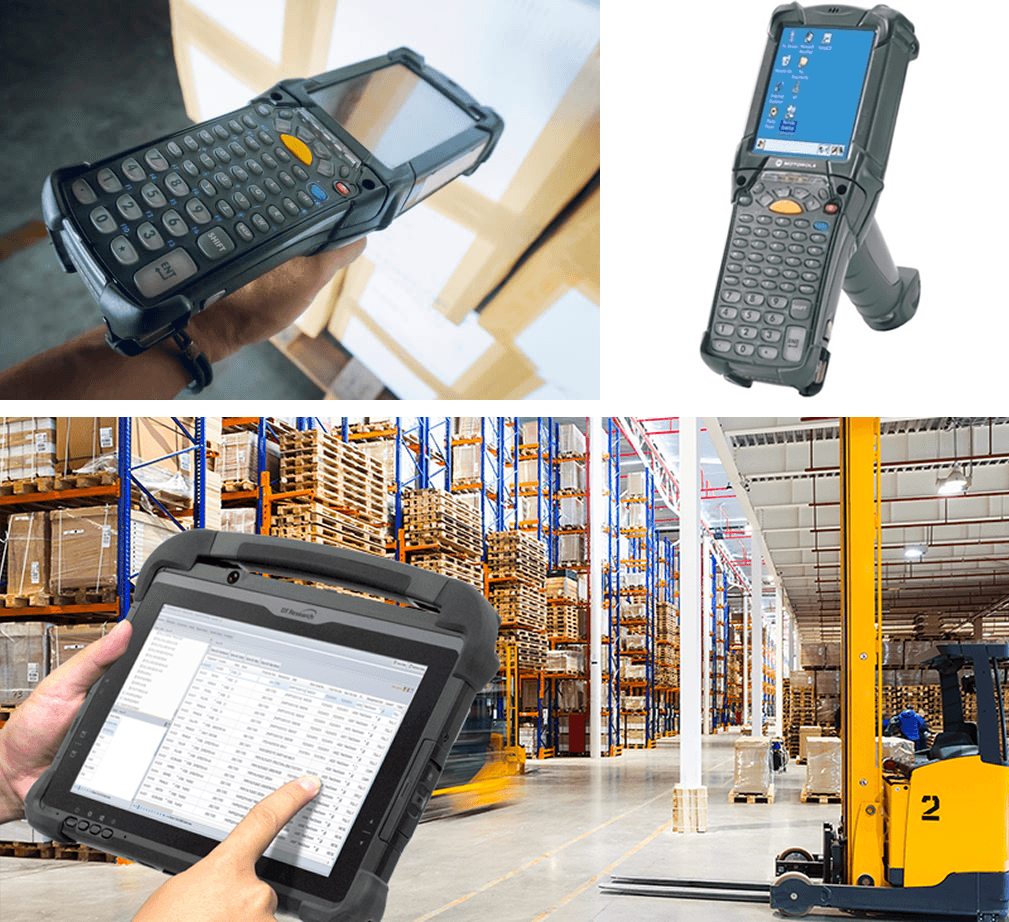
The RF gun, one device type, small screen, used one-handed throughout every Movement app flow
You cannot design for a warehouse from a desk.
Operators always had one hand occupied, holding an RF barcode scanner. Every interaction had to work single-handed, with thick gloves. Tap only. Large targets. No scrolling. Scanning wasn't a secondary feature. It was built into the core of every flow, appearing at multiple points in every task. Before designing anything, we had to learn the warehouse, the terminology, the physical sequence of each process, how stock actually moved through the space. Two device types added another layer: a small-screen RF gun for Movement, a tablet for Weigh & Dispense. Some processes required switching between them mid-task.
One entry point. Every app.
The Aggregator was the home screen of the connected worker platform, the place operators landed when they opened the device, and the launchpad for every other app. The UX problem it solved was navigation: with multiple apps available depending on role and task, operators needed a clear, role-aware entry point that surfaced the right tools without cognitive overhead. Designed for tablet.
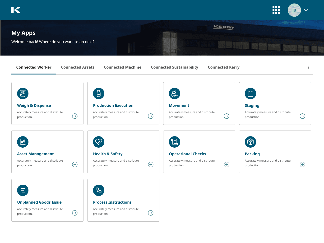
The Aggregator, role-aware home screen combining all apps in one entry point
Weigh & Dispense app screens, tablet UI showing bin list, component selection, weighing and dispensing flows
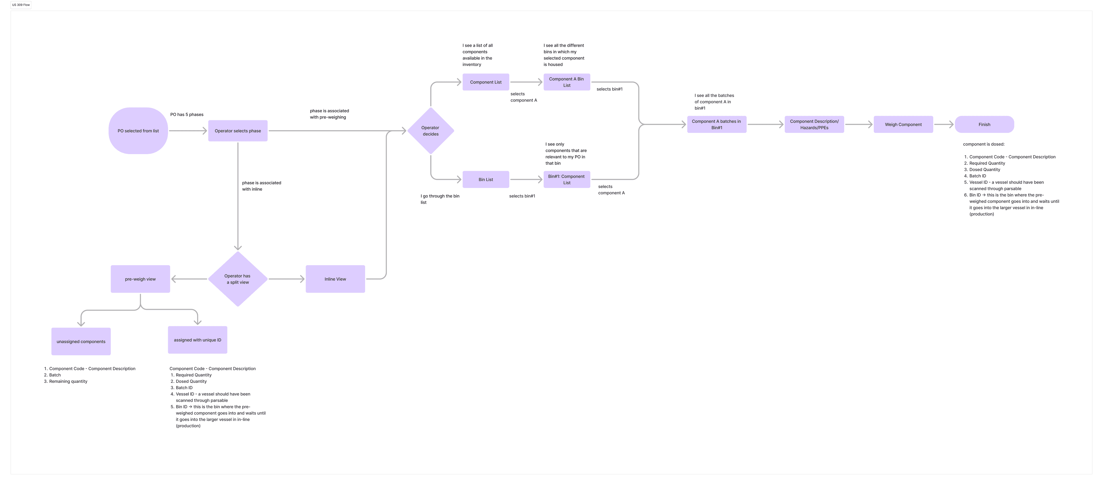
Proposed UX flow, shift start-up scale verification showing weight ID entry, validation states, and confirmation paths
Locate. Weigh. Dispense. Repeat.
Operators used this app to locate, weigh, and dispense the ingredients that go into food flavouring recipes. The flow differed by warehouse layout, two validated paths through the same task depending on how stock was organised. At the start of every shift, operators verified their scales using reference weights, with the screen showing progress toward the target in real time. A back-weighing mode let operators remove material from a batch and track what was taken against what was needed.
Small screen. One hand. One action at a time.
The Movement app tracked components moving in and out of the warehouse, and between storage locations within it. The device made this the hardest design challenge: RF guns have small portrait screens, held in one hand while the other scans. One action per screen. One decision at a time. Nothing else. The flows covered standard location-to-location moves and split moves, where a batch needed to be divided before part of it moved. All of it on a screen roughly the size of a credit card.
Movement app screens, RF gun UI showing bin-to-bin movement, SSCC scanning and split quantity flows
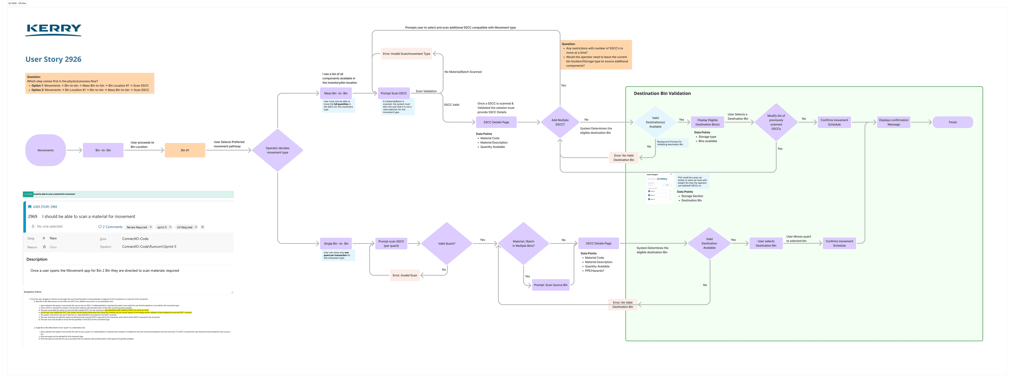
UX flow for US 2926, Movement app showing SSCC scanning, split quantity logic, and destination bin validation paths
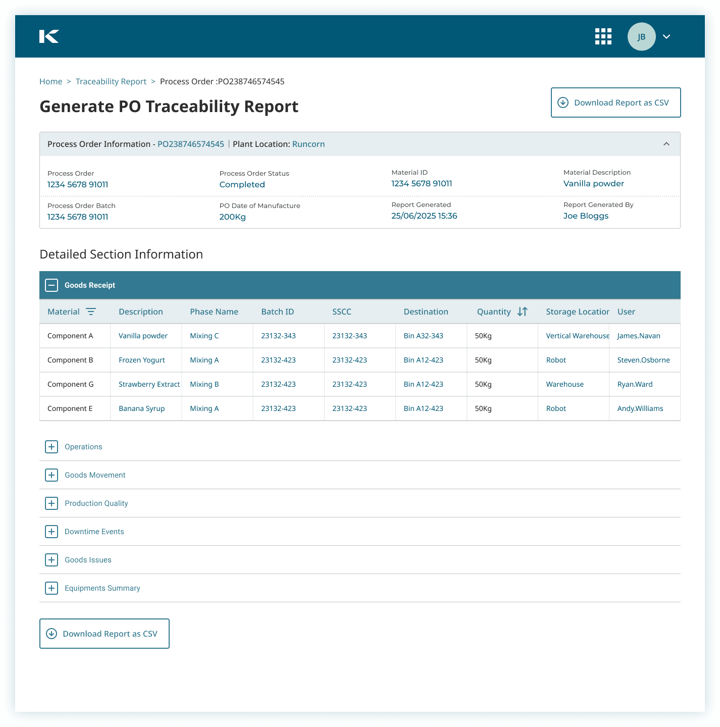
PO Traceability Report, full purchase order visibility in a single structured view
Every purchase order. Full visibility.
The PO Traceability Report gave warehouse managers and supervisors a structured view of purchase orders moving through the supply chain, tracking status, location, and progress at each stage. Before this, traceability required navigating multiple systems and manually correlating data. The report surfaced that information in a single structured view, making it possible to answer the question 'where is this order and what's happening to it' without leaving the platform. Designed for tablet.
Scoping can determine the success or failure of your product.
In three months, I got up to speed with how warehouses work, learned the terminology, fixed the ways of working, unified the component library, and helped deliver four of the seven planned apps. But it became clear the task was bigger than anyone had scoped. The risks I flagged and the conversations that followed made the client realise the original project scope wasn't realistic, something that traces directly back to design not being involved at the start. They made the call to move to Tulip, a low-code platform built specifically for warehouse management. More cost-effective than building everything from scratch. The right decision for them. Still one of the most valuable engagements I've had.

Me realising the scope was never going to fit in three months.