Data & Dashboards
AI Classifier Dashboard Redesign
20+
Classifiers in a single scroll
3
User groups. One interface.
7
Research insights
The tool that scored every video on the platform required a manual to operate.
, Classifier Dashboard, pre-redesign
Client
Global Streaming Platform
Role
Lead UX Designer
Timeline
Aug 2022, Sep 2022
Tools
Figma, FigJam, MS PowerPoint
A tool used daily. That required training to understand.
A global streaming platform used an internal Classifier Dashboard daily to understand how AI systems made decisions about video content, affecting monetisation, age restrictions, and content moderation at scale. The tool showed all classifier models on a single scrolling page with no consistent structure, no clear actions per user group, and no unified view of how decisions were made or what triggered them. Getting the full picture meant opening external tabs, cross-referencing separate tools, and assembling context manually. Some users needed formal training just to operate it.
THE REAL PROBLEM
"When a tool requires training and still causes confusion, that's not a learning curve, that's a structural problem."
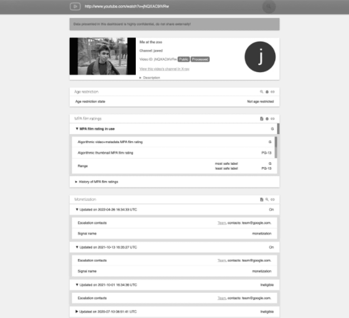
The existing dashboard, one long page, 20+ classifiers, no hierarchy, no clear user group actions
Three different jobs. One interface that served none of them.
A classifier product manager debugging model performance needed different information than an operations specialist triaging a creator escalation, and both needed something entirely different from what a leadership team reviewing platform health needed. The existing tool gave all three the same undifferentiated wall of data. The redesign problem wasn't about adding features. It was about creating structure that let each user group get to what they needed without navigating through everything that wasn't relevant to them.
01
Structured navigation
Collapsing the flat list of 20+ classifiers into a searchable, filterable structure, with recently used surfaced at the top. Eliminating the scroll problem at the structural level rather than patching it.
02
Tiered access by role
Each user group sees the depth of information relevant to their role. The same underlying data, surfaced differently depending on whether you are debugging a model, triaging an escalation, or reviewing platform health.
03
The lateral reference
No direct market equivalent existed for an AI classifier dashboard. The structural model came from financial tools, specifically the challenge of making the relationship between decisions and outcomes legible in real time.
Six weeks. Two personas. Seven insights.
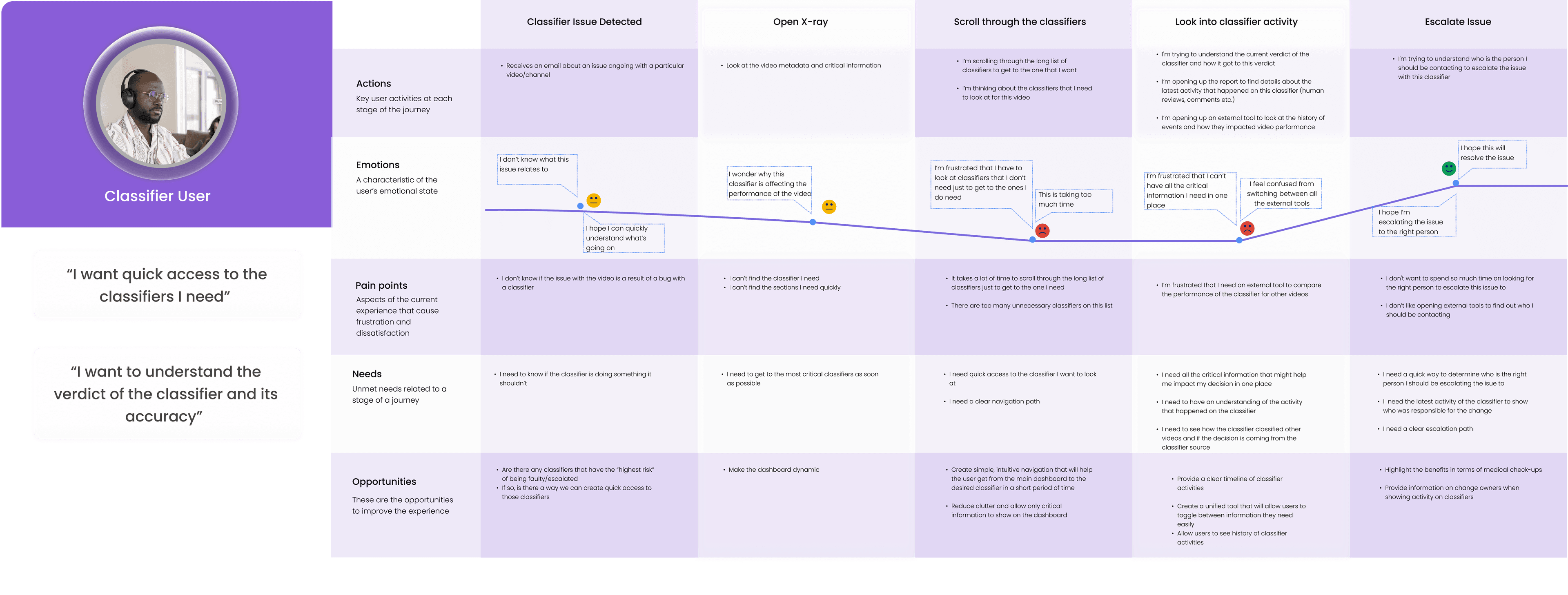
Classifier User journey map, confusion on open, frustration mid-scroll, resignation at escalation
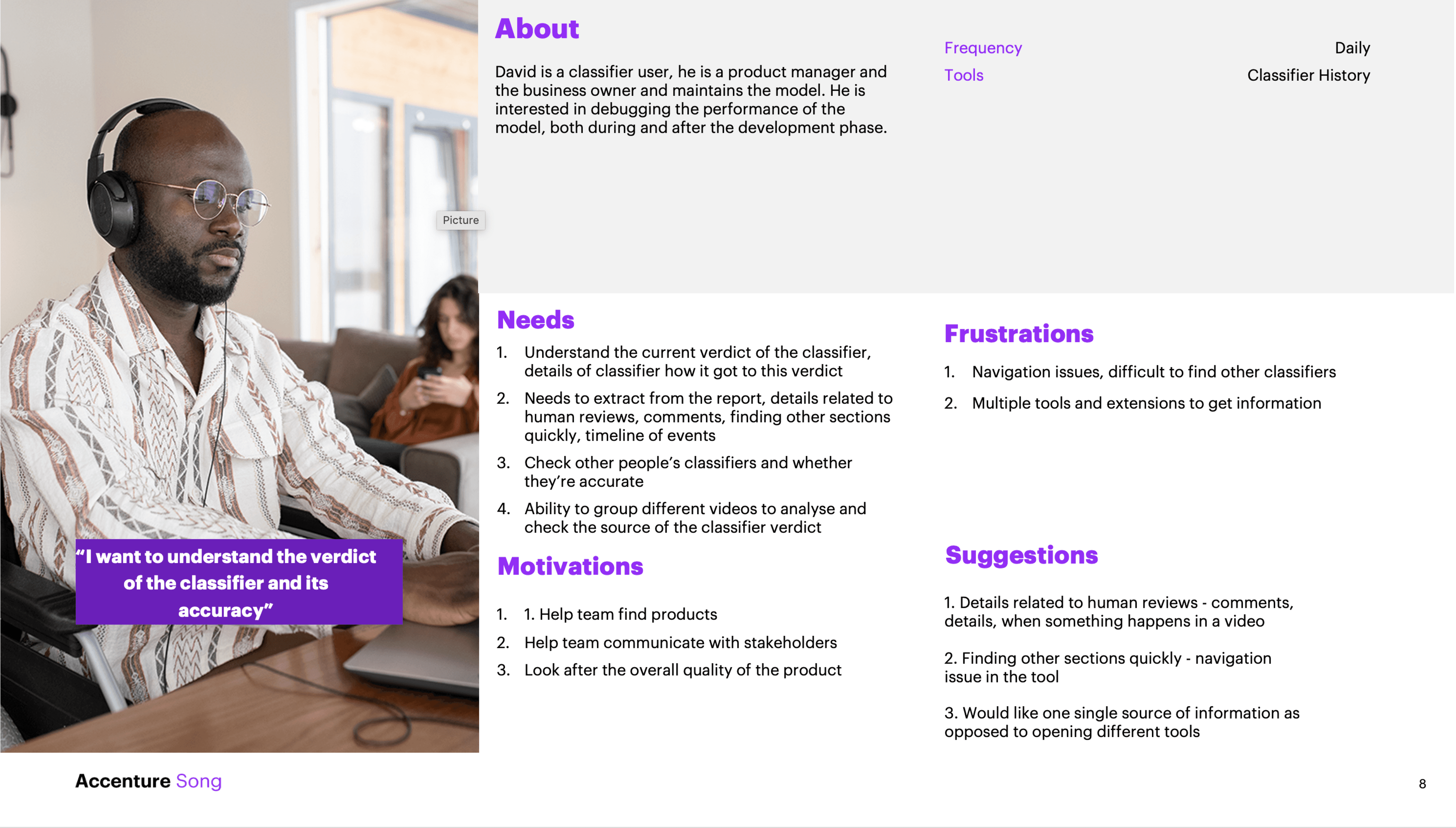
Classifier User persona, primary user group profile defining goals, frustrations, and decision context
Seven things broken. All pointing to the same root.
Research surfaced seven consistent insights across user groups. The navigation wasn't intuitive, with 20+ classifiers, finding a specific one meant scrolling through everything. There was no clear view of how classifiers affected content performance. Different user groups needed different data but got the same interface. Formatting was inconsistent across classifier types, with no clear indication of which verdict was active, where it originated, or which took precedence. Classifier ownership wasn't visible without consulting external documentation. And the tool required training that differed depending on which user group you belonged to. All seven traced back to the same structural failure: one undifferentiated page designed for nobody in particular.
Structure first. Then screens.
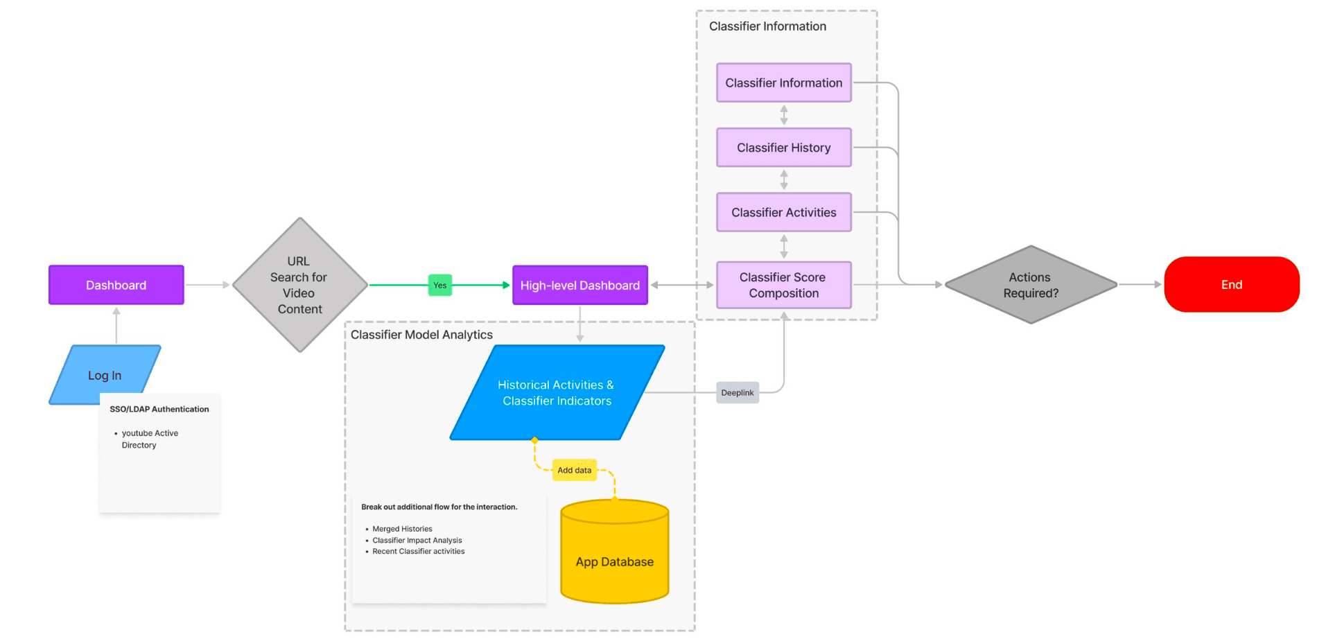
To-Be user flow, login to classifier detail to action, with model analytics running in parallel
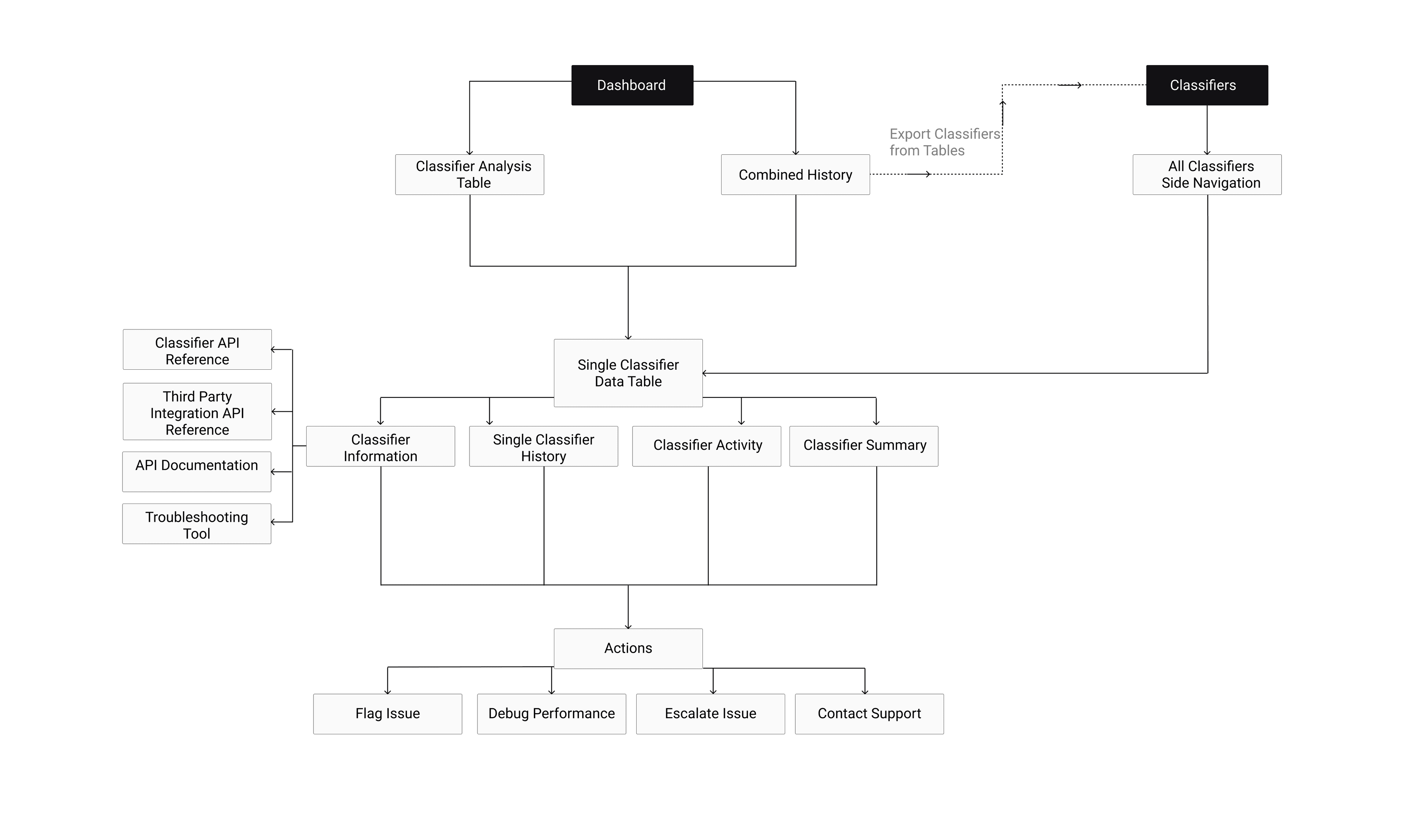
To-Be IA, dashboard to classifier detail to terminal actions: flag, debug, escalate, contact support
Structure before screens.
Before any interface work began, the user flow and information architecture were mapped from scratch. The To-Be flow showed the path from login through URL search, to a high-level dashboard, into classifier information and actions, with historical activity and model analytics as a parallel layer. The IA established the hierarchy: Dashboard → Classifier Analysis Table → Single Classifier Data Table → Classifier Information, History, Activity, and Summary, with Actions (Flag, Debug, Escalate, Contact Support) as the terminal layer. Mapping this before touching Figma meant the structure was agreed before the interface was designed.
Decisions and outcomes on one timeline.
The first major design problem was making the relationship between classifier decisions and content performance visible without leaving the dashboard. The Combined History view overlaid classifier verdict changes directly onto a video performance chart, so operators could see at a glance which changes correlated with drops or spikes, where the change originated, and what type of override was applied. Model Score, Rater Override, and Manual Override each rendered differently on the timeline, with impact level colour-coded across the chart. No tab switching. No manual assembly.
Classifier decisions overlaid on video performance data, verdict changes and impact visible on one timeline
Searchable left nav, consistent four-tab classifier structure, contributing signals visible at a glance
Every classifier. Immediately findable.
The second problem was navigation. With 20+ classifiers on a flat page, finding the right one was a manual scroll through everything irrelevant. The redesigned IA introduced a persistent left navigation panel with search, filter, and recently used, so users could get to the classifier they needed in seconds. Each classifier opened into a structured detail view with four consistent tabs: Summary, Activity, History, and Classifier Information. The Summary tab showed the currently active verdict, contributing signals, and the score/threshold for each. Consistent structure across every classifier meant no more guessing what format the next one would use.
History that explains itself.
The final piece was the History view, showing how a classifier's verdict had changed over time and what those changes did to content performance. The chart overlaid the verdict line, threshold, and current verdict against impression data across a six-month period, with low, medium, and high impact classifier events marked directly on the timeline. For users trying to debug model performance or understand the downstream effect of a manual override, this was the view that answered the question without requiring external tools or additional context.
Verdict history, threshold, and impression data on one chart, low, medium, high impact marked inline
When there is no direct market equivalent, look sideways.
The financial chart comparison wasn't obvious. A performance dashboard and an AI classifier tool seem like entirely different problems. But both are fundamentally about making the relationship between decisions and outcomes legible in real time, and that shared logic gave us the structural model. The constraint of working through intermediaries rather than users directly was the other thing worth carrying forward: filtered research is still research, but you design with more uncertainty than you want to acknowledge at the time. The seven insights were real. The confidence intervals around them were wider than the presentation suggested.

Users navigating 20+ classifiers on a single scrolling page.