Data & Dashboards
Supply Chain Control Tower
200+
Supply chain stakeholders
9
System touchpoints per planner per day
64%
Said data analysis was their primary activity
A stockout ten days away. Nobody knew.
, Global Pharmaceutical Company Supply Chain, pre-Control Tower
Client
Global Pharmaceutical Company
Role
UX Design Lead
Timeline
Mar 2024, Sep 2024
Tools
Figma, FigJam, MS PowerPoint
Nine systems. One planner. No complete picture.
Global Pharmaceutical Company's global supply chain operated across multiple systems, teams, and geographies, with no shared view of what was happening across any of them. Supply chain planners navigated up to nine different touchpoints in a single working day just to assemble the information needed to make a single decision. KPI reporting happened after the fact, in spreadsheets, reviewed in meetings where the decisions that needed to be made had already been delayed.
THE REAL CHALLENGE
"Different stakeholders had fundamentally different definitions of what supply chain health meant."
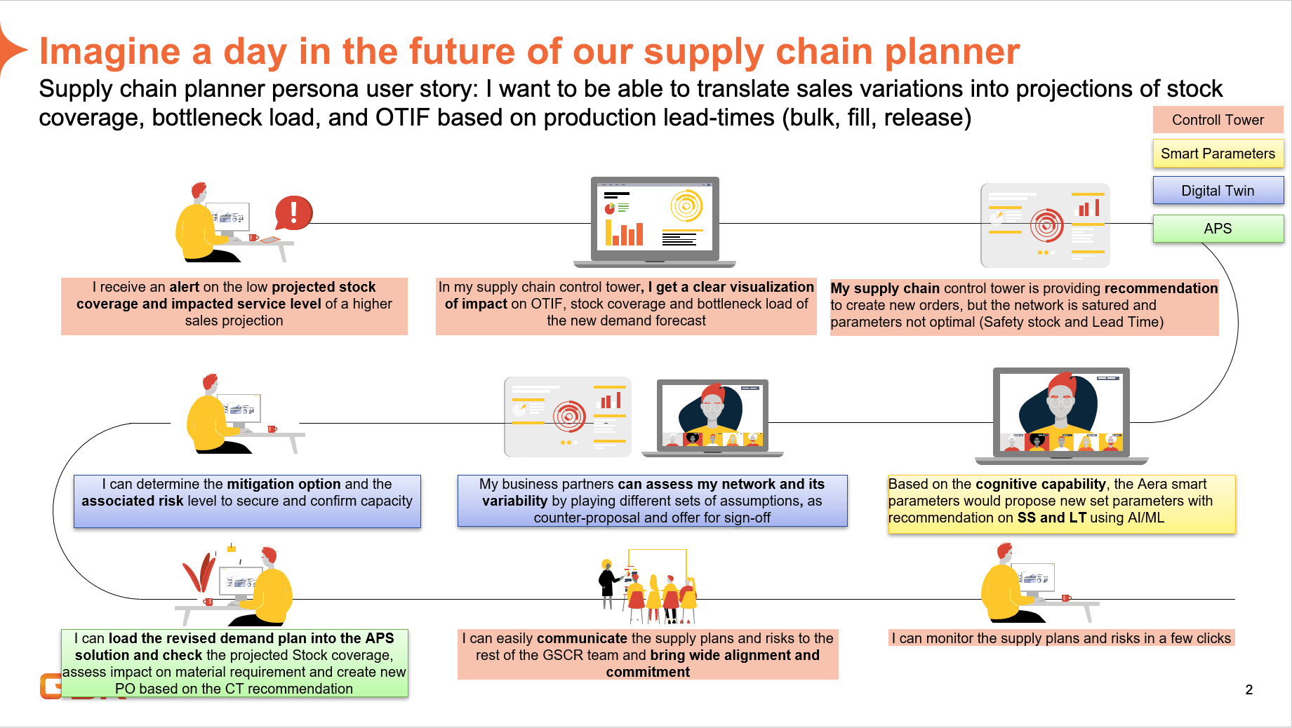
The daily reality of a supply chain planner before the Control Tower, 9 touchpoints, no unified view
Not a reporting interface. A decision-support tool.
Supply chain visibility tools typically show you what has happened. Global Pharmaceutical Company needed a system that could show what was about to happen, and what to do about it. The complexity wasn't in the data. It was in making that data legible and actionable for stakeholders who each had different definitions of what supply chain health meant for their role. That vision would shape the roadmap. Research would determine where to start.
01
Persona-driven architecture
Stakeholder interviews surfaced distinct supply chain roles each needing a different entry point. Personalised dashboards meant each user saw relevant depth without noise meant for someone else.
02
Forward-looking, evidence-led
The vision was predictive, alerts, recommendations, inventory projections. Research would determine what Phase 1 needed to deliver first to make that vision possible.
03
Infrastructure-aware scoping
When tech discovery confirmed AI infrastructure wasn't ready, research gave us the evidence to scope Phase 1 intelligently. Reporting-first wasn't a compromise, it was the foundation.
Research. Pivot. Delivery.
THE ORIGINAL BRIEF
RESEARCH FINDINGS
REDEFINED SCOPE
Data analysis was the activity stakeholders spent most time on, and only 40% felt the Control Tower supported it.
The brief changed before the work began.
Before research began in earnest, a tech discovery changed the shape of the project. The infrastructure needed to power the intelligent AI capabilities originally scoped, predictive alerts, inventory projections, decision recommendations, was not yet built. AI features would need to be deferred. That decision could have been demoralising. Instead it sharpened the brief. If AI was off the table for Phase 1, research needed to answer a different question: what did stakeholders need most right now, from the data that already existed?
Twelve roles narrowed to one team. Then the real question started.
We initially mapped 12 different stakeholder roles across the supply chain organisation. Through that process, we narrowed focus to the Supply Chain Leadership Team, they were the group that needed transparency and visibility across the system most, and whose decisions had the broadest downstream impact. The core research question became: what data actually mattered to them, and what did they need to be able to do with it? The interviews gave us the answer. The ask was better data visibility. What surfaced was a deeper need, not just to see the numbers, but to understand what they meant and what to do next.
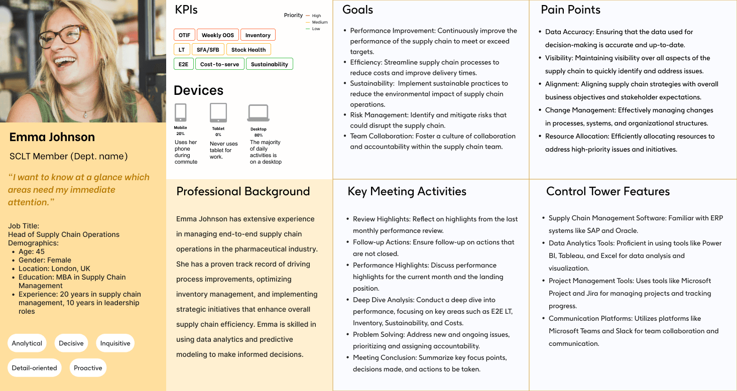
SCLT persona, defining the primary stakeholder group and their decision-making context
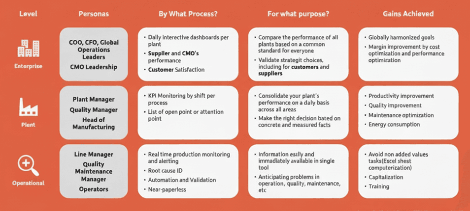
Operational layers, mapping the organisational structure that shaped the personalisation architecture
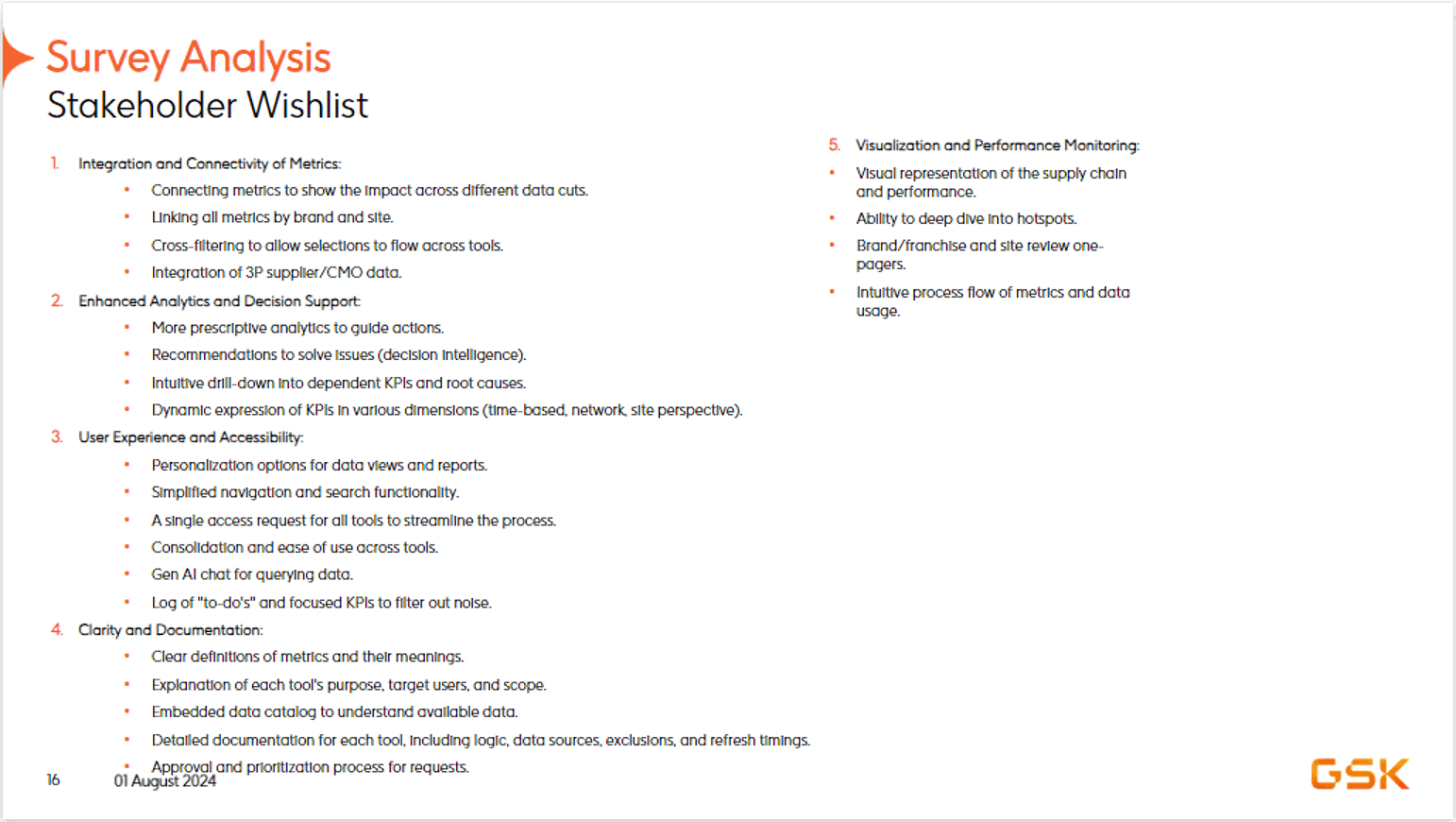
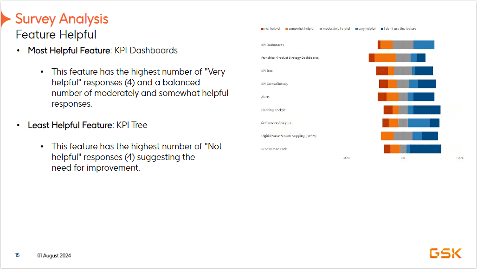
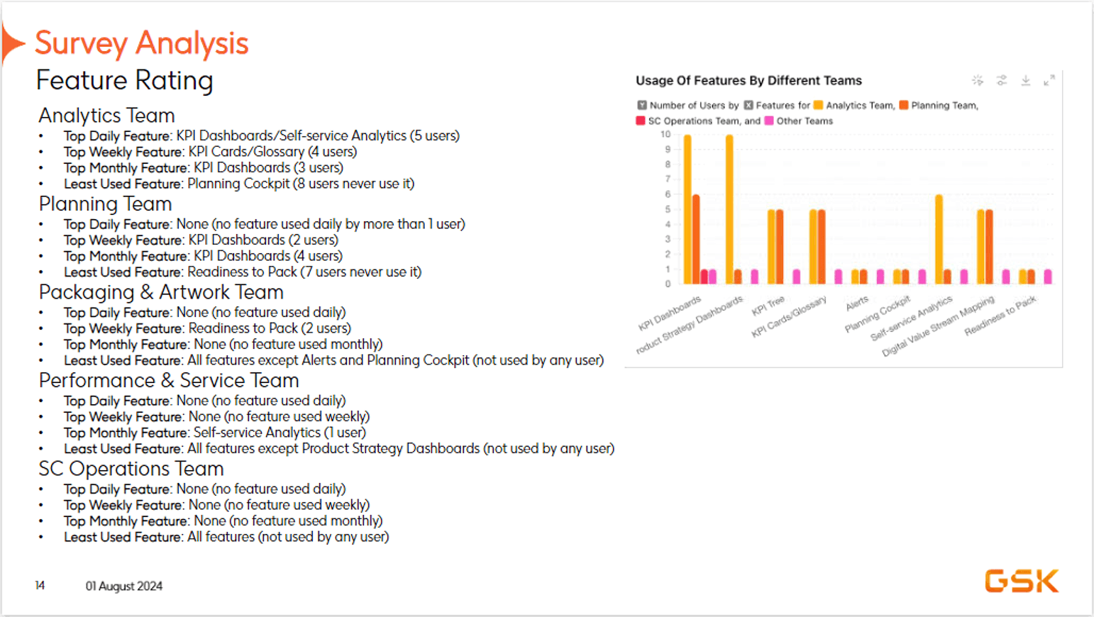
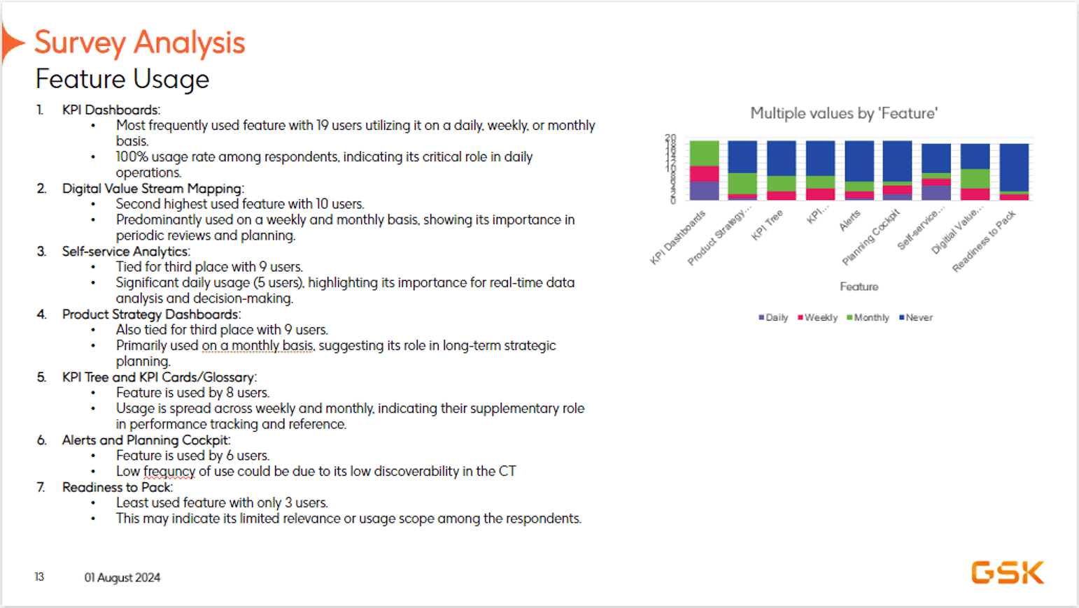
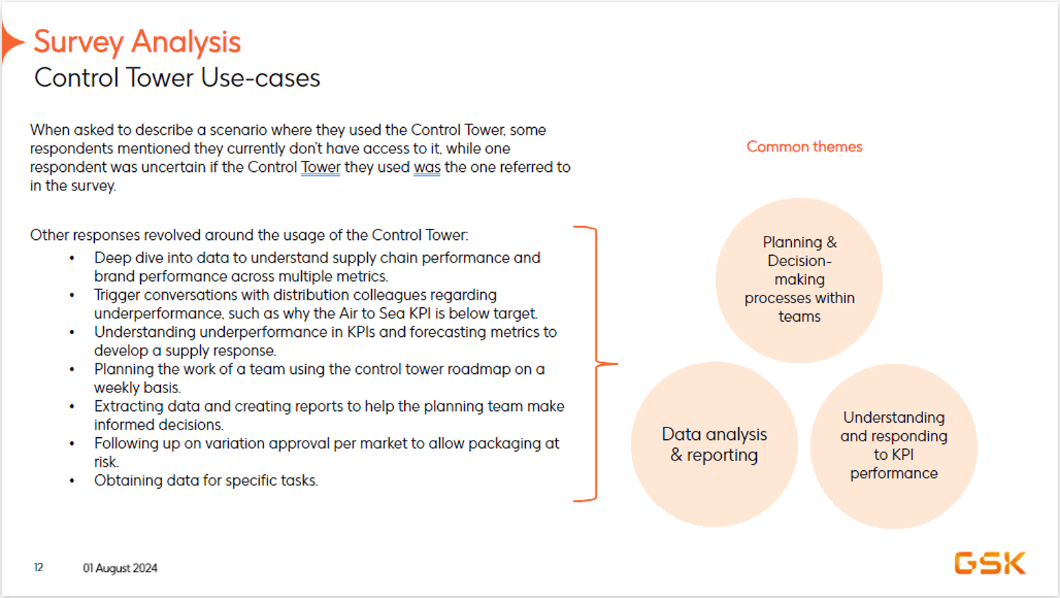
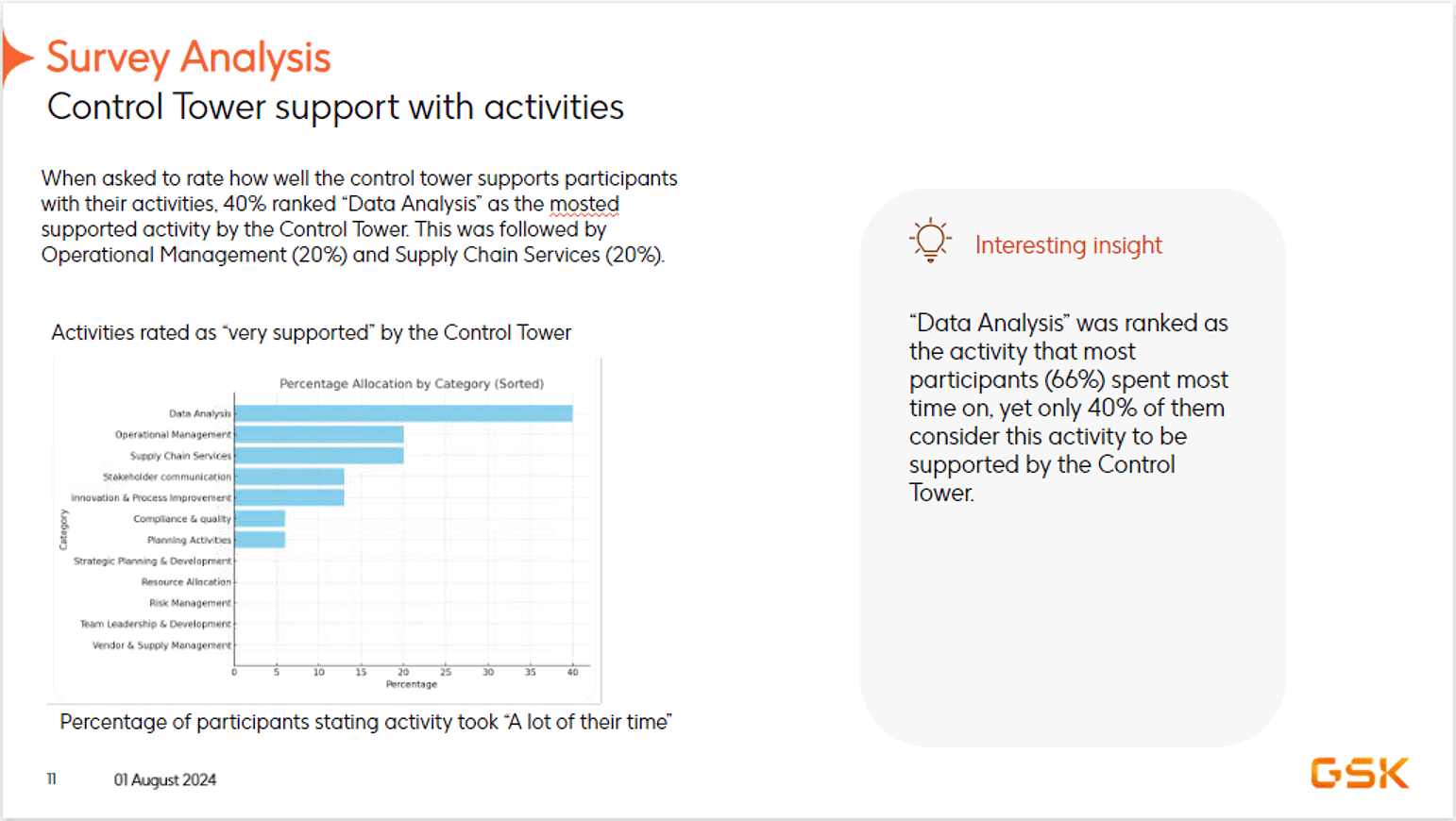
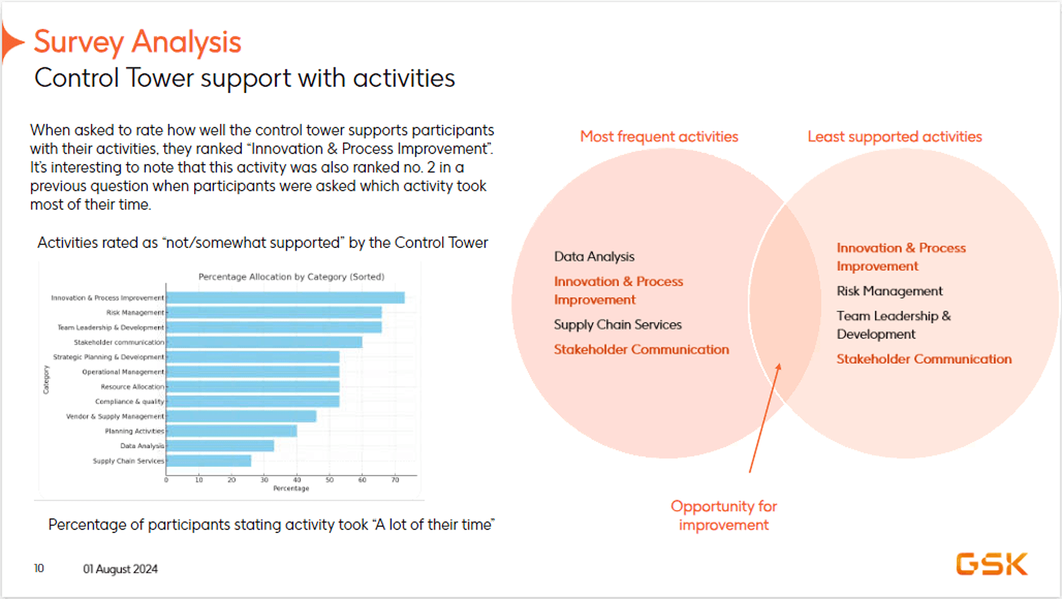
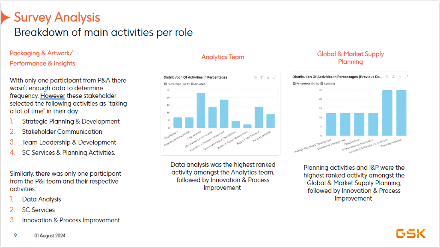
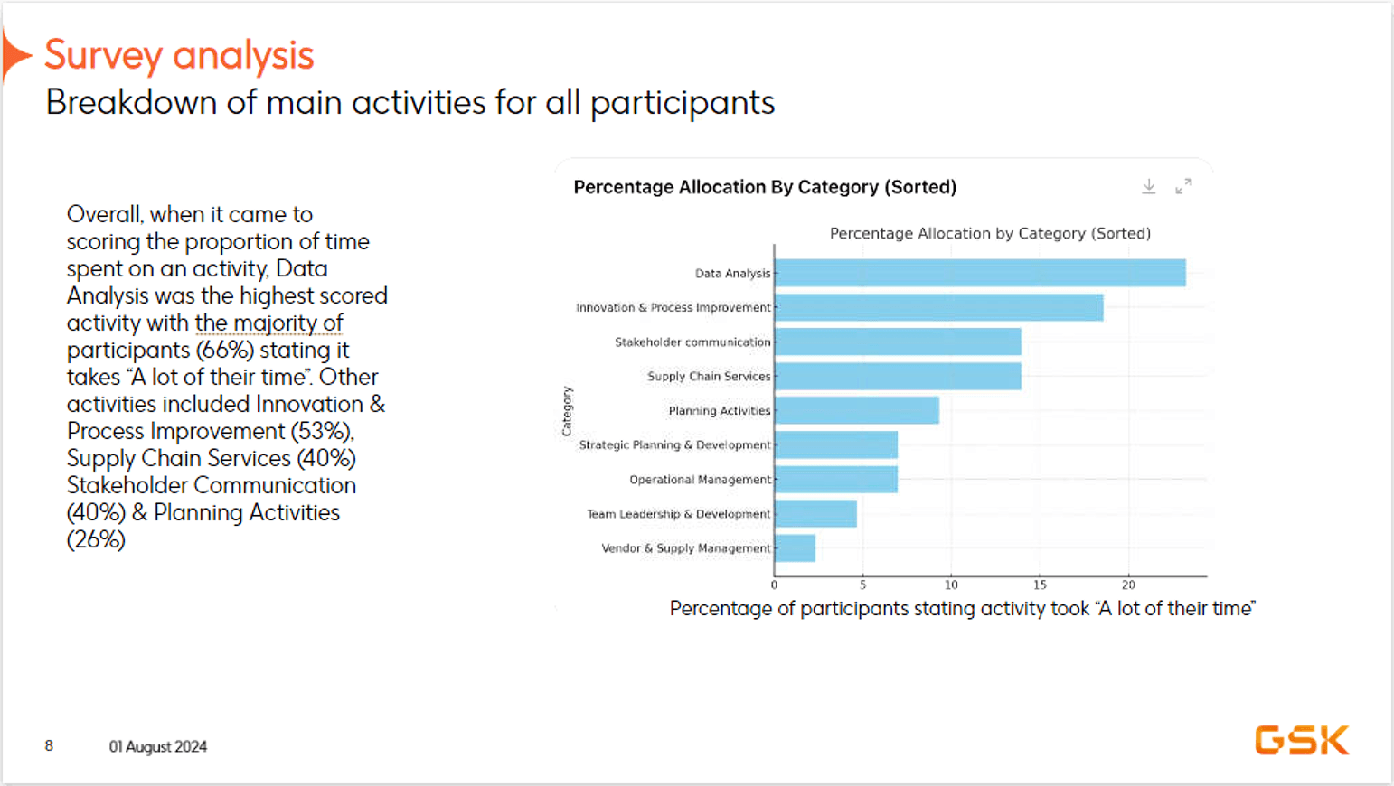
Full survey results across stakeholder groups, 9 slides
The feature nobody was using told us everything.
I ran a structured survey across stakeholder groups to understand which features were actually being used, which were most helpful, and where the Control Tower was falling short. KPI Dashboards were the most used feature, 19 users, daily, and the most helpful. But the finding that reframed everything: data analysis was the activity that took stakeholders most time, and only 40% felt the Control Tower supported it. That gap gave us the evidence to define a focused five-feature roadmap for Phase 1.
Frustration in. Determination out.
The journey map followed the VP of Global Supply Chain Planning across seven stages, from Prep for MPR through to Strategic Review. The emotional arc was consistent: frustration at the start, a brief window of confidence after the MPR meeting, then overwhelm returning as weekly data quality issues made it impossible to know which KPIs actually needed attention. Determination hardened at Root Cause Analysis, but only because finding what caused a deviation required cross-functional effort that should have taken seconds.
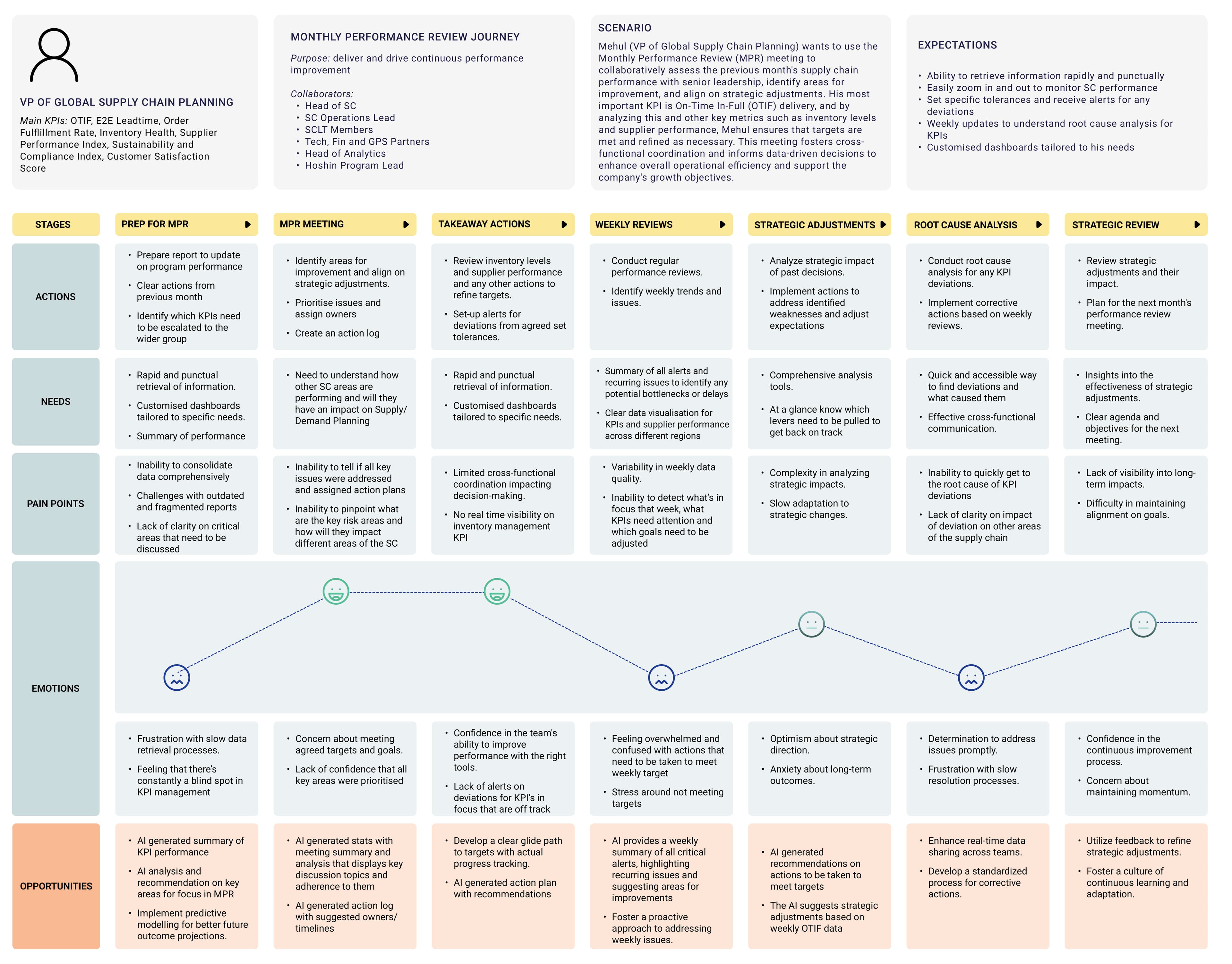
Full journey map across 7 stages, actions, needs, pain points, emotions, and opportunities
Three problems. Three features. One wireframe handover.
Supply Chain Live View, iterations showing the evolution of the end-to-end visibility screen
See the whole chain. Then drill into what's breaking.
The research made one thing clear: planners had no single surface showing supply chain health across all areas simultaneously. A stockout ten days away was invisible until someone checked the right system on the right day. SC Live View solved this, an end-to-end view of the supply chain showing KPI status across API, Manufacturing, Quality, Inventory, Logistics, and SC Level Design, with red and green indicators making the problem areas immediately visible. From there, planners could drill into any area to investigate further. Alongside SC Live View, the Alert Hub gave stakeholders real-time visibility on emerging issues, stockouts, late shipments, and KPI deviations surfaced as actionable alerts with financial impact, therapy area, and site context already attached.
Not just what the KPI is. What drove it.
Data analysis was the activity stakeholders spent the most time on, and the one least supported by the existing tool. KPI Rooms addressed this directly. Rather than a static dashboard, KPI Rooms gave stakeholders a structured environment to track KPI performance over time, understand what had influenced it, and model what different interventions might achieve. The root cause analysis layer went further: for any alert, stakeholders could move from the high-level signal to a full breakdown of contributing factors, supplier delay uncertainty, blocked material movement, quantity variances, with AI-generated analysis and Accept/Adjust/Reject recommendations built in.
KPI Rooms and root cause analysis, from performance tracking to AI-generated driver breakdown
Unified reporting module, MPR and cross-stakeholder report consolidation
One report. Every stakeholder. No manual assembly.
The Monthly Performance Review was being built by hand every month, pulling data from multiple systems, collating reports from different supply chain functions, and formatting everything for leadership review. The Reports feature replaced that process with a unified reporting module that pulled together inputs from across the supply chain organisation into a single structured view. What previously took significant manual effort became something the system could generate, with human review and sign-off built into the workflow rather than bolted on at the end.
The wireframes shipped. Then the client came back.
Once the priority roadmap was agreed, research and requirements were translated into directional wireframes covering the five core features, a structured starting point for the Global Pharmaceutical Company design team to build from. But the engagement didn't end there. The MPR view landed well enough that the client wanted it extended to mobile, so a mobile version of the reporting feature was scoped and designed. They also asked to explore what Copilot integration could look like, even though the AI infrastructure was still being figured out, wanting to show stakeholders the potential of the system before the technical decisions were finalised.
Mobile MPR and Copilot exploration, scoped after the client requested a mobile extension and AI feature preview
The hardest part wasn't the design. It was the room.
The biggest learning from this engagement was the gap between vision and infrastructure. The original brief included AI-powered features, predictive alerts, intelligent recommendations, decision support. The infrastructure to deliver them didn't exist yet. That gap between what a product could be and what the organisation could actually build shaped every scoping decision we made. The second learning was more unexpected: internal misalignment on whether the product should exist at all. One team argued Global Pharmaceutical Company already had a C3AI licence that did a very similar job, why build something new? Another argued that owning software they built themselves would give them control over their data that a third-party licence couldn't. That debate was never fully resolved during the engagement, and it created friction that no amount of good design work could fix. What I came in with was a single Excel sheet, a wishlist from various stakeholders with no shared structure or priority. What followed was months of stakeholder interviews, survey analysis, competitor research, supply chain education, and synthesis before a single wireframe was drawn. The design work was the straightforward part. The stakeholder management, especially with stakeholders who had no prior experience working with designers or making technical decisions, was where the real complexity lived.

Accurate representation of stakeholder alignment.